Slowglass is a quirky geometric semi-serif typeface with softly rounded triangular serifs in five weights, accompanied by flamboyant geohumanist italics. It supports extended Latin, Cyrillic and Greek.
Let’s start from
The beginning
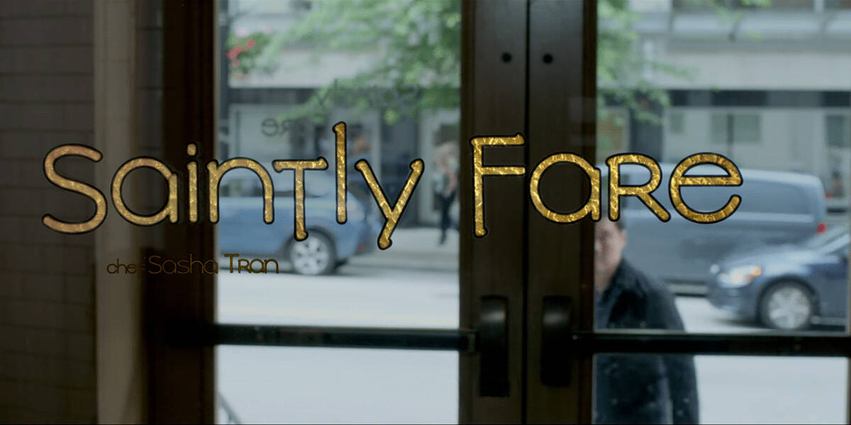
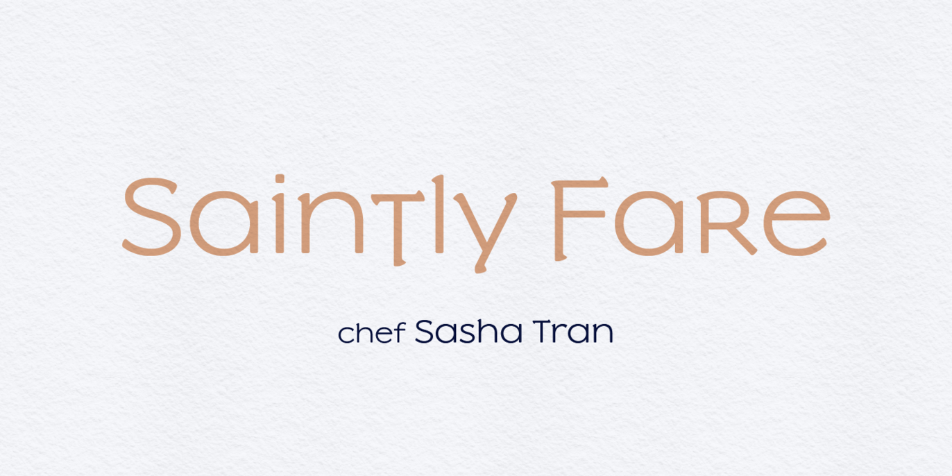
The initial 2017 release of Slowglass was a two-weight unicase design full of quirky choices inspired by the uncial script. It was my first published font. Fast-forward to 2019, I spotted my font in the wild, used for the logo (and menu) of the fictitious Saintly Fare restaurant in the movie Always Be My Maybe. I was thrilled to see it out there, except… the logo didn’t look all that great. It had a faux-boldy black stroke, the half‑uncial–inspired spur on the e was chopped off, and it was capitalized using a hastily-doctored uppercase. I took the hint and decided to get back to the drawing board.

Slowglass was re-released as an extended bicameral family in 2021. I redesigned the entire character set, added a new more conservative set of capital letters, and created three new darker weights along with some brand new quirky italics. I delegated the unicase glyphs to a separate Slowglass Alt cut, and designed more conventional forms for the main cut and the Text cut. These alternates can be also mixed and matched via OpenType stylistic sets.

Can you see some
Uncial roots?
Slowglass is built on a wide-stride, stocky skeleton with generous bowls and arches. More trails of uncial inspiration can be found among some of the alternates, but maybe the most uncial thing is that Slowglass looks good inch‑tall.


OpenType features
It’s good to have
Options
Slowglass features several out‑there signature glyphs, but also offers milder choices for text usage.


